Featured


In the hours after the April 5 earthquake, I quickly rigged up maps and charts to give readers the information they needed to stay safe. The aftershock likelihood chart live-updated for several days after the initial quake.
I used Google Apps Script and an undocumented API to grab the source data underlying the New York Police Department’s user-facing data dashboards, which only offer summary statistics. The resulting data give us a unique window into how the NYPD reports and classifies arrests.
In the run-up to a major change in New York City’s enforcement of short-term rental rules, I tracked the number and composition of Airbnb listings. Using R for recurring data analysis, QGIS for geospatial work, and Felt for user-facing maps, I visualized buildings where short-term rentals are banned and neighborhoods that are particularly affected by the rule change.
As dangerous levels of particle pollution blanketed New York City, I spun up a quick-and-dirty data dashboard, combining city and federal data to equip New Yorkers with the information they needed to stay safe. I also published a standalone data story showing that asthma-related ER visits skyrocketed as air quality declined.
I used Mapbox Studio and Mapbox GL JS to overlay data from the National Hurricane Center with a map of public housing and new development in New York City. The result shows how storm surge, combined with a Sandy-like storm, could threaten hundreds of thousands more New Yorkers by 2080.
In the run-up to NYC’s municipal worker vaccine mandate, I analyzed publicly available 311 data to identify a dramatic uptick in complaints about uncollected trash. I also mapped the data by zip code to help guide field reporting.
I maintain and add to an auto-updating COVID dashboard built with Google Apps Script and Datawrapper. In 2021, I led an overhaul of the page to focus on vaccines and variants. I also added a section on COVID in schools, which has since been retired.
I scraped and analyzed COVID case data and ventilation reports for 1,000 school buildings for a series on inadequate ventilation upgrades by NYC’s Department of Education. Our work won an award from the New York Press Club.
I’ve shared the data and methods for this story in a GitHub repository.
I scraped, compiled and analyzed data from disparate sources on COVID cases, testing, vaccination and closures in schools. I shared the results in more than a dozen stories, as well as a section of Gothamist’s COVID data dashboard. Our reporting helped hold the Department of Education accountable and gave caregivers the information they needed to gauge their children’s safety at school.
I collected, cleaned and analyzed a dataset of 35,000 journal articles for a Spectrum story about collaborations between researchers. I wrote the story to highlight the findings, interviewed the researchers spotlighted, and worked closely with a talented designer to bring the project to life.
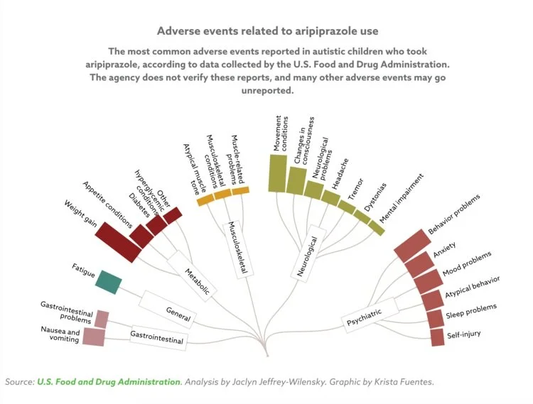
I analyzed FDA data to determine the most common negative reactions in autistic children to the atypical antipsychotic drug Abilify for a Spectrum story. I worked with a designer to create the data visualizations.
I worked with Spectrum reporters to create a series of charts for a breaking news story about a new CDC report on autism prevalence.
I collected and analyzed data and created a Datawrapper chart for a Spectrum reporter’s story about clinical trial sponsors who fail to report results in line with FDA rules.
A deep dive into the relationship between child abuse and lax state laws governing homeschooling parents. I wrote, reported, and analyzed the data for this piece, and designed two interactives and two maps to showcase it.
I used Medicare reimbursement codes to estimate the cost of different mobility features for advanced prosthetics. Then, I created an interactive “calculator” allowing users to see about how much it would cost to get a prosthetic with features that were important to them, like the ability to walk backwards or climb stairs.
Using a list of 311 calls regarding illegal pets, I mapped complaints about roosters to make an educated guess about which NYC zip code has the most roosters.